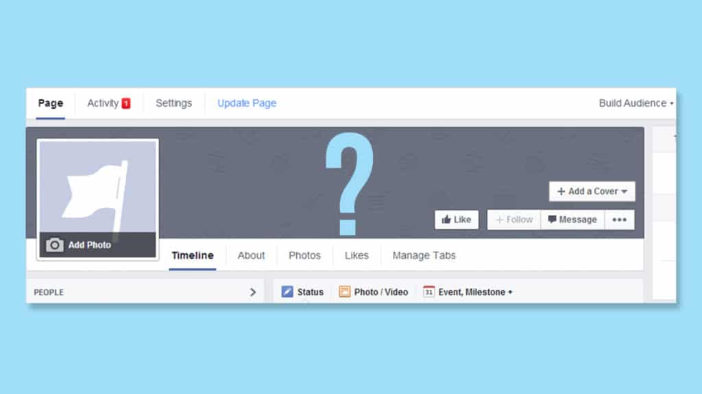
Your Facebook cover photo matters. Why? That’s simply because it’s the first thing people see once they visit your Facebook Page. It’s the one that catches all the attention at a glance. And for that reason, you need to have a great cover photo to make sure your audience’s interest level stays high. Whether your page is about providing a customer community, improving your brand presence, or a means to promote and sell, a great cover photo is indeed a must. Here’s how you create one:

[tweetthis twitter_handles=”@1alexkhan”]Here’s what you need to know in making a great cover photo on Facebook. Read everything here:[/tweetthis]
Your Facebook Cover Photo Should Follow the Right Size
First and foremost, let’s start with the basics. Your cover photo should follow the optimal size set by Facebook – 851 pixels wide by 315 pixels (desktop) and 640 pixels wide by 360 pixels (mobile). Having this one right will make sure your photo will show as it is. If you will use an image more than the recommended size, you will have to crop it. And if you use an image that’s lesser than the recommended size, it will be stretched making it look like a low-quality image. This is why before designing a cover photo, get the size right.
Put the Focal Point at the Center
When designing your image or choosing an image, make sure that the focal point or the core message of the picture is at the center. Why you want to do that is because of two reasons. One, Facebook mobile will crop the image into 640 pixels wide by 360 pixels – they will choose the centermost of your image. Thus, both desktop and mobile version will have a great Facebook cover photo. Two, it doesn’t stress your user’s eyes giving them a better viewing experience.
Try to Match Your Design with the Rest of Your Profile
What I’m trying to express here is that if your profile picture is mostly red, you’d like your Facebook cover photo to have a dash of red in it. Also, it’s not only your profile picture, it’s also about your posts or overall content. If you’re all about fashion, do have a cover photo that emphasizes your niche as much as possible. Don’t make it random or just choose a great looking image that you think looks good – make it sweet and, at the same time, relevant.
Provide a Description with a Call to Action
Just like your profile bio on Instagram, Twitter, Periscope and everywhere else, you should place a call to action at the end of it. An ideal call to action is a link to your landing page that will help you earn money (most ideal one), or to your other social media profiles. This way, when people do click your Facebook cover photo, there’s a huge chance that they’ll click the link and see what it is all about. By the way, be certain to shorten it to make it discreet and less spammy.
